Fun with Congressional District Maps
So if you were to ask a political analyst why things are this way, I'm betting that many of them would suggest the cause, at least in the House of Representatives, is due to Gerrymandering of congressional districts. The term Gerrymandering refers to the strategy of manipulating the boundaries of voting districts so as to gain an advantage over your opponent. There are two strategies employed known as "packing" and "cracking". The goal of packing is to isolate as many of your opponents into a single district, which you will concede, so that you can win a larger number of the surrounding districts. Cracking does the opposite, it aims to dilute the strength of a district that is controlled by your opponent by mixing in your own supporters. These two strategies are usually used in concert for the greatest effect.
Packing, in particular, tends to produce districts that elect Representatives with extreme political views. Since the district is essentially a single-party district there's no challenge in the general election, and hence no incentive to run a moderate candidate. This, I believe, is one of the more serious problems with our current Congress, and it got me wondering if it can be traced directly to the maps of Congressional districts.
What I needed was a diagnostic of a Gerrymandered district. They're easy to spot by eye (they look kind of like salamanders, which is what coined the term in the first place) but I had no intention of looking through all 435 Congressional districts for oddities. I needed an automatic classifier that would be able to separate obviously-gerrymandered districts like North Carolina's 12th:
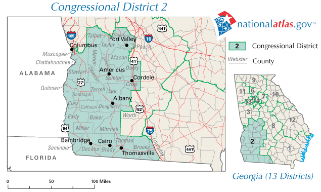
from districts with relatively normal boundaries like Georgia's 2nd:
I decided to use the ratio of a district's perimeter to its area as a proxy for gerrymandering. For districts like Georgia's 2nd that are close to rectangular, this number is relatively small. However, districts like North Carolina's 12th, with all its twists and turns, should have a much larger ratio relative to normal.
So I wrote a script to compute this ratio for every district and make a map of the districts with the largest ratio. Ok, so how did it do? The answer is it performed surprisingly well given the very limited input information.
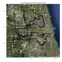
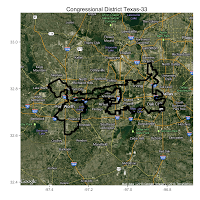
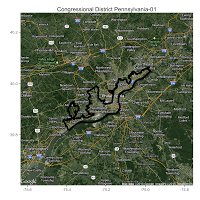
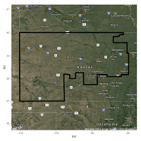
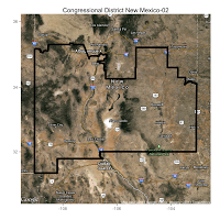
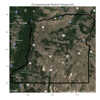
Here are some of the maps I made of districts with the highest ratio of perimeter to area:
|
|
|
|
|
|
Notice how the obviously gerrymandered districts all occur around urban areas? That's not by accident, it's a great example of "packing" in action. After a quick inspection, I'm feeling pretty confident in my perimeter-to-area classifier's ability to pick out gerrymandered districts. So let's see what else we can learn from this.
Here's a histogram of all the districts' ratios broken down by which party currently has control of the district.
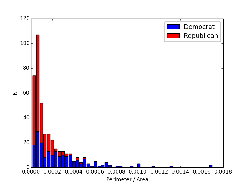 |
| Every district with a ratio greater than about .0005 is Democratically-controlled. If my classifier is working, that means that every one of the most gerrymandered districts is a Democratic district. Doesn't that sound like shenanigans? Source Code |
I found it remarkable that all of the districts in high-ratio tail of the distribution are Democratically-controlled. This suggests that Republicans are winning the gerrymander battle and successfully concentrating Democrats into "packed" districts. Maybe that's how, despite winning more votes than Republicans, Democrats currently own a 234-195 minority in the House. Representative democracy in action!
.gif)
Leave a Comment