(More) Fun with Congressional District Maps
It turns out I was on the right track, but didn't have things quite right. A friend pointed out a link to a study that a professional geographer did on the same topic. His analysis was pretty close to mine, except he used the the ratio of perimeter-squared over area. This keeps the ratio dimensionless and is the proper way to do it. My ratio was actually biasing my result towards finding smaller districts (which tend to be in urban areas, which tend to be Democratic, yadda yadda yadda).
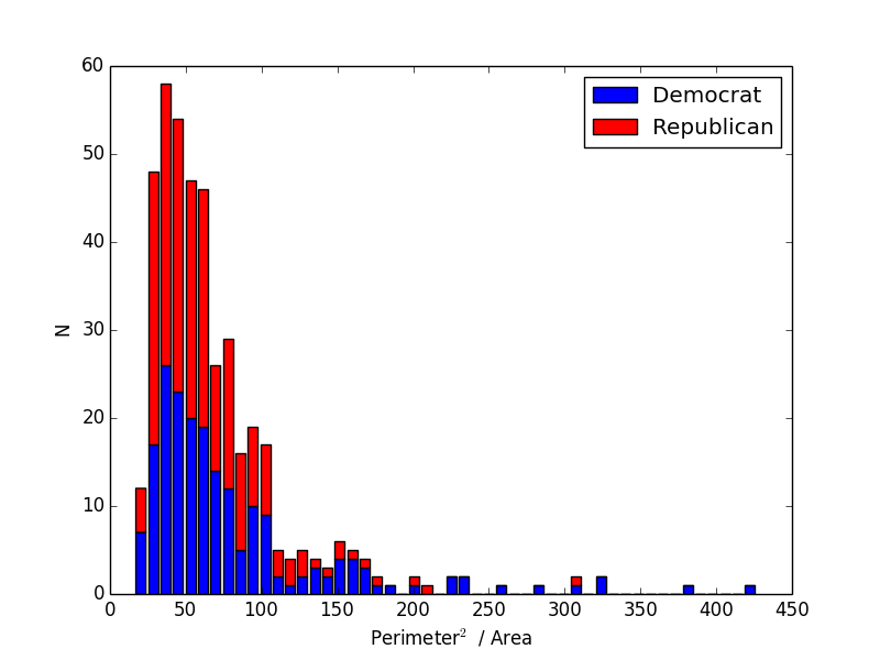
So I re-did my calculation and here is the revised histogram using the correct ratio
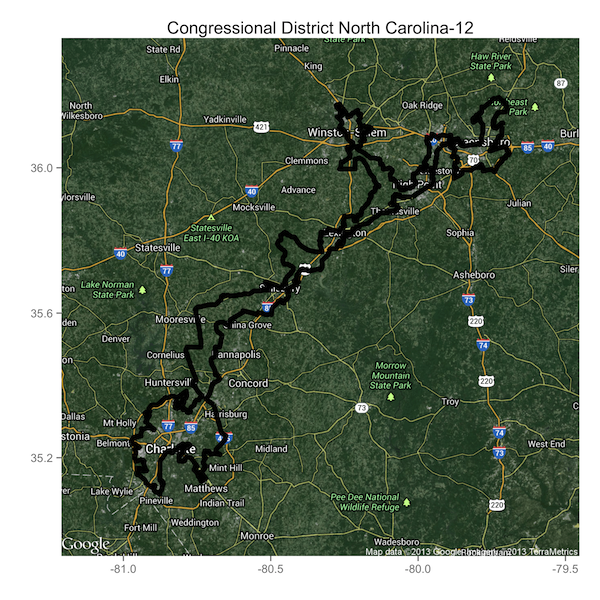
You can see one or two Republican districts in the tail towards the right, but it's still a lot more blue than red. A good sign that this is working is that I now have North Carolina's 12th, one of the most obviously gerrymandered cases, as the district with the highest ratio.
Piggybacking off another comment on my last post, I also decided to add a few more dimensions to my data set. The commenter suggested that the perimeter-to-area alone might be indicative of natural boundaries that occur in urban areas, and not any malicious political intent. So I decided to add some extra information and see if it makes gerrymandered districts pop out more obviously.
I added two more variables for each district: the margin of victory in the 2012 election, and the fraction of neighboring districts with the same party affiliation. Remember that "packing" is the strategy of putting all of your opponent's supporters in a single district so that you can win the surrounding districts and come away with a net gain in Congressional seats. As a result, districts that are examples of packing should have a comfortable margin of victory and should be surrounded by districts under the control of the opposite party.
This seemed like it should be easy, but finding the data and getting it into a neat form for analysis proved more difficult than I expected. I took the results of the 2012 Congressional elections from the Federal Election Commission. Unfortunately, their monstrosity of a spreadsheet tallied all the races (primary and general) for every candidate in every wacko third party for every seat. This took some work to clean up. After I got it in order, I tallied up the margins of victory for each district on a scale ranging from 0 (a dead heat) to 1 (a blowout with one candidate receiving 0% of the vote).
The next task was to go through each district and calculate the fraction of neighboring districts under the same party's control. The first step involved finding the neighboring districts. This took a lot of thinking. I was going to do this by going through each district and calculating the distance to all the other districts' boundaries but that would have been horrible. The boundaries are specified in 100 meter intervals, that means the arrays that hold them have hundreds of thousands of points. If I'm calculating distances, the number of calculations I'd have to do is astronomical: for P points and D districts it would be $O(P^2 D^2)$. With P around 100,000 and D=435, that number is huge.
Instead of doing things the brute force way, I got creative and realized that neighboring districts would share some of the same points in their coordinates. If I could convert these coordinate arrays for each district into sets, I could take advantage of Python's blazingly fast set operations. With a quick one-liner I can find if any two districts share common points (intersect) and the average-case time it takes for this operation is $O(P)$, a big improvement over $O(P^2)$.
Ok, so now that I've calculated everything I need, what do the data look like? Here is a 3D plot of the perimeter-to-area ratio, margin of victory, and the fraction of neighboring districts under the same party control. Dots are color coded according to the current controlling party.
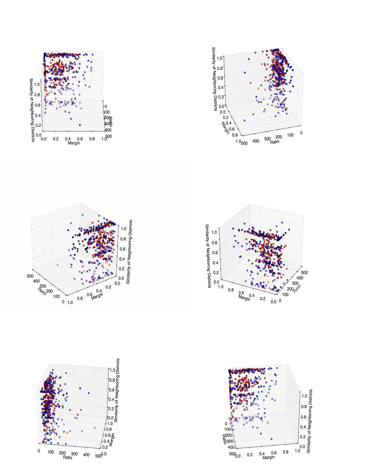 |
| 3D scatterplot of all 435 Congressional Districts, broken down by perimeter-to-area ratio, margin of victory in the 2012 elections, and the fraction of neighboring districts under the same party's control. Blue and red map to the current controlling parties in the obvious way. Source code: district_findneighbors.py, explore_district.py |
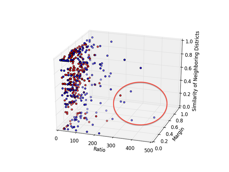
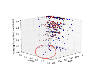
The most interesting cases are those with a large ratio (so they have a funny shape), high margin of victory (so they're primarily a single-party district) and a low fraction of neighboring districts under their party's control (so they're an isolated island). These guys are prime examples of the "packing" strategy in action!
|
|
As a final point, let's beat the dead horse that is North Carolina's 12th District. This Democratically-controlled district shows up with the highest ratio, one of the largest margins of victory, and exactly ZERO neighboring Democratically-controlled districts. If I've done nothing else, I've at least shown that politics in North Carolina are messed up.
Here it is, one more time. The district that's been referred to as "political pornography".
Leave a Comment