Hurricane Sandy, One Year Later
When I was home I was bombarded with these "stronger than the storm" commercials, and I thought it was strange that they seemed to only focus on the Jersey shore's recovery. I got the impression from people I talked to that the majority of the recovery effort has been focused on New Jersey's moneymaker: its beaches. While this at first made sense to me, the longer I thought about it the more unfair it seemed. Many of the shore homes being rebuilt are people's second homes--a luxury item. Sure it sucks to lose that shore house, but it sucks a lot more to lose your only house. Anyone in that situation would feel pretty left out of the recovery, especially given how much attention is focused on rebuilding the shore.
I set out to visualize the damage from Sandy as well as the recovery. I wanted to know if there was an income gap in the recovery, and whether there was a bias towards rebuilding the shore at the expense of inland areas. It turns out, this was harder than I thought.
I started with housing assistance data from FEMA. Here they break the total housing damage down by zip code and also list the amount of FEMA aid given. Datasets are split among homeowners and renters. Since the total damage is not listed for renters, I decided to base my analysis on the homeowners data. This will skew my results towards higher-income families though, since most low-income families rent.
I wrote a Python script to parse this file and extract some values for analysis. I initially set out to make maps by writing directly to a blank image of the state with its zip codes identified. To do this, I used the Beautiful Soup package to parse the XML in a similar way to what I did in my first post. However, I soon found that this was ugly and uninformative. I needed to overplot my results onto a real map with cities listed so that people could identify where the damage is. I looked all over for a Pythonic way to do this, but I never found anything as good as ggmap in R. The only problem is that I don't know R very well. My solution: do everything in Python and only write out what needs to be plotted in R! I did the analysis, set the scale for the fill color, and created a mapping from zip code to fill color all in Python, then just dumped this out to be read by my R script.
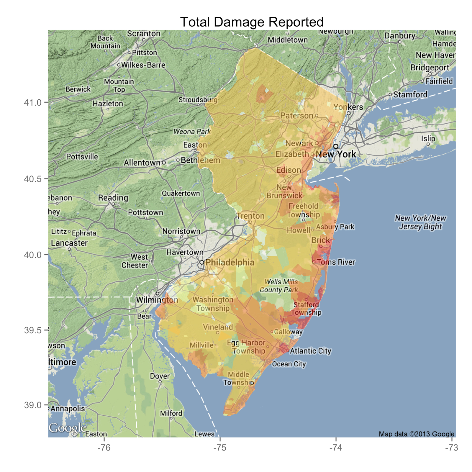
Here's the first map, a map of total homeowner damage in the state.
 |
| source: Python R |
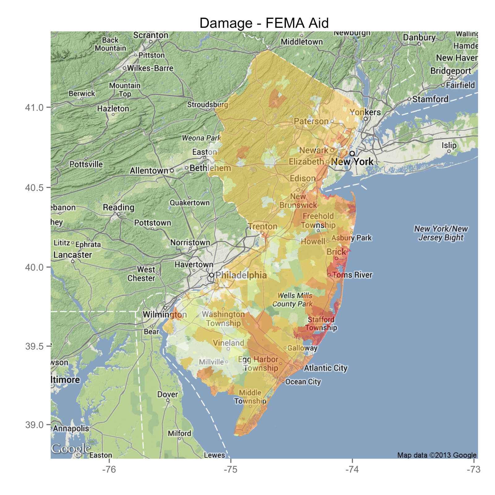
Now here's a plot of total damage minus the amount of FEMA housing aid.
 |
| source: Python R |
That plot doesn't look too much different from the first. The color overlay is lighter in South Jersey, indicating that much of the area has at least received the money to cover rebuilding costs. Again, when I visited my parents near Philadelphia, that was pretty much the picture that I saw.
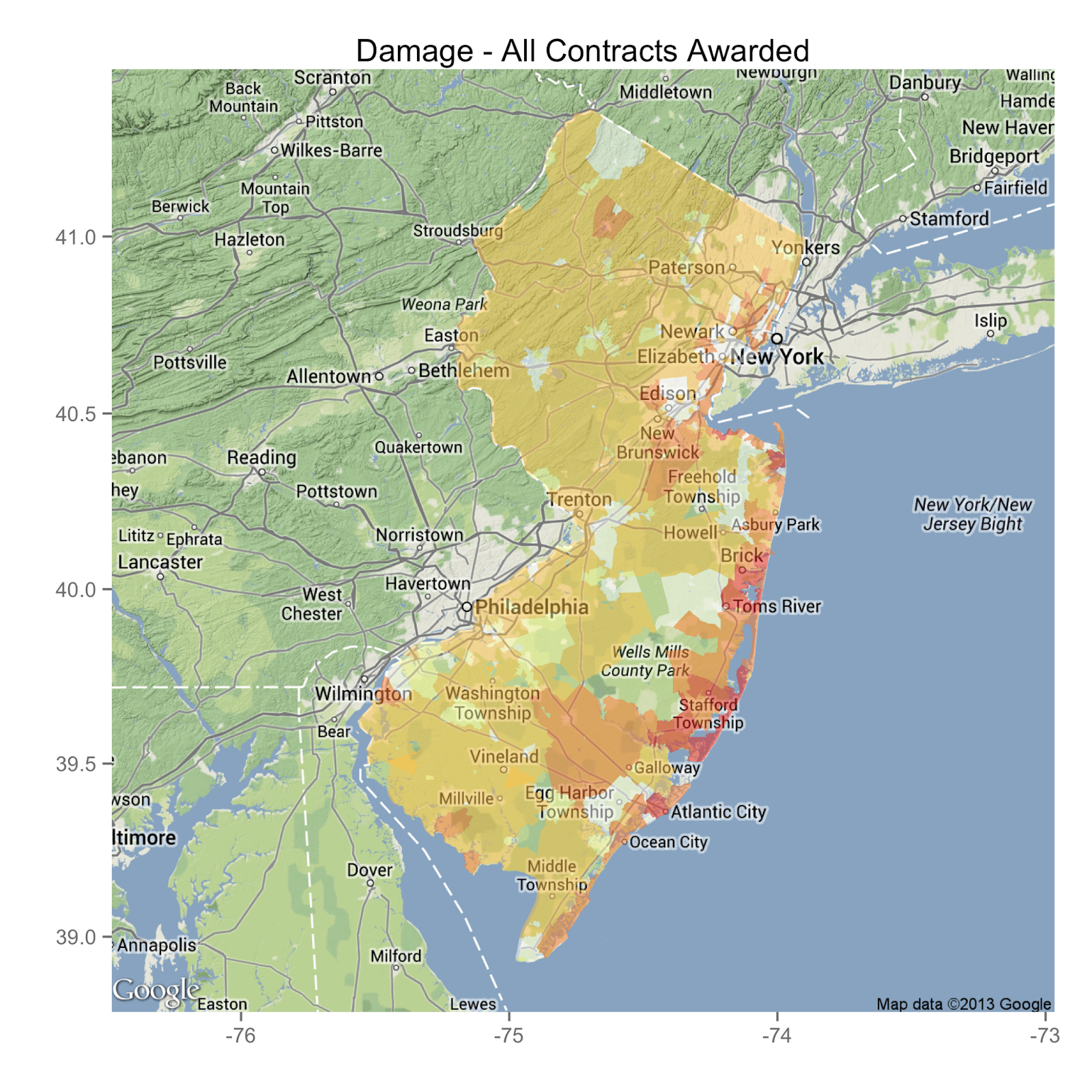
I also found data from the office of the Comptroller, compiling all the Sandy-related contracts awarded for recovery. I can sum these up and subtract from the total damage to get another estimate for how recovery is going.
 |
| source: Python R |
Again, it's the coast that still has the largest deficit between recovery assistance authorized and damage done. Clearly these data are telling me that my initial understanding of the situation was wrong. The state is right to spend more money on rebuilding the shore because that's where most of the damage was.
However, there's a flaw in this analysis. I'm still only analyzing the housing damage reported by homeowners. I'm missing a large group of the state's population, and probably those with the lowest income who were financially hit the hardest. I've tried to account for this by scaling the damage by the mean income for each zip code in the FEMA claims, but this number is self-reported and not properly normalized by household. The resulting maps didn't look much like anything so I dropped it. In the end, I guess I learned that coastal storms do more damage to coastal populations. Wow. What a breakthrough.
Leave a Comment